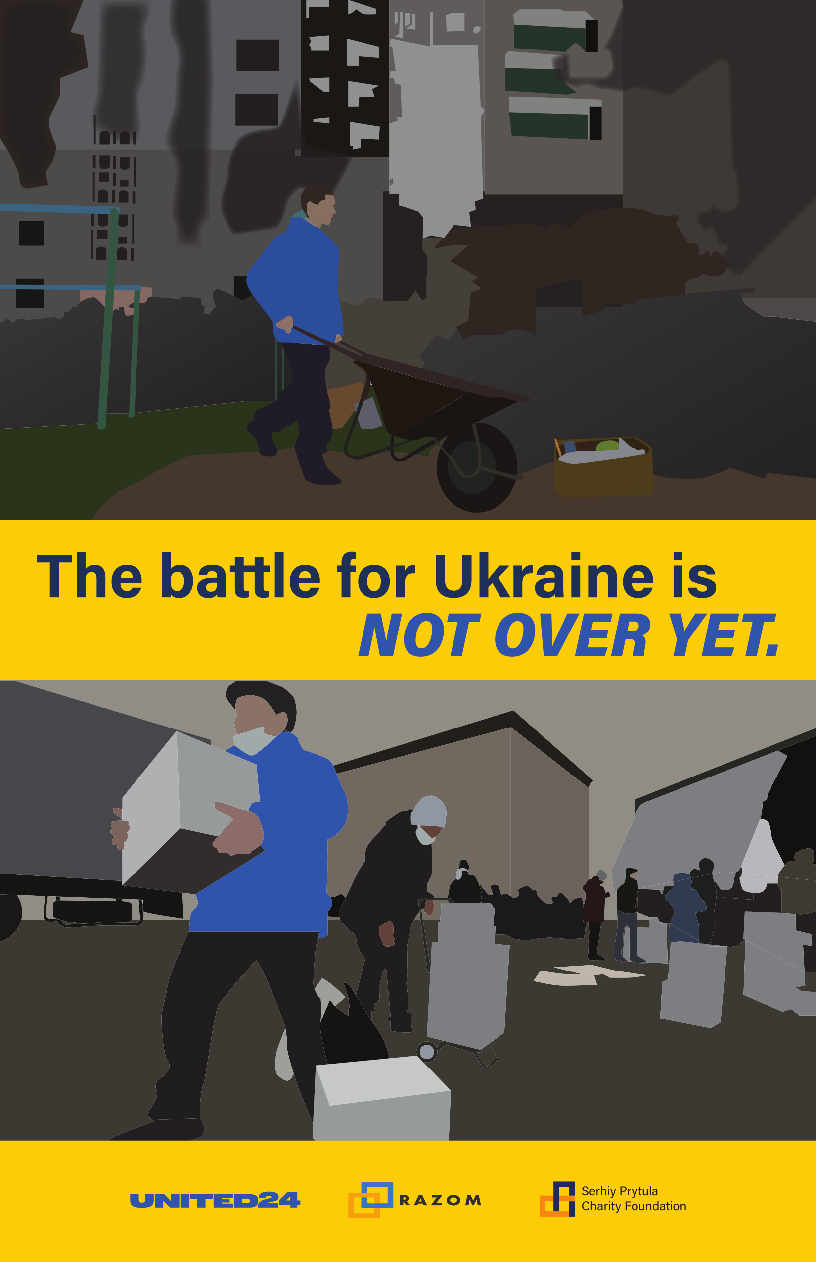
Graphic Design: Poster
When I was deciding what to do, I considered what was relevant but somewhat forgotten. The answer? Ukraine. By this point, the war had raged on for about a year, so news stations had relegated the issue to political meetings.
I used the official Pantone colours that were released by the company in support of Ukraine. I decided to use yellow as the background and blue as the foreground because if I did it the other way around, that would be IKEA's colour scheme. And I'm not going to infringe on a popular brand lest my poster become associated with it.