Home

About me

I like to think of myself as a somewhat creative person. My main hobbies are program­ming, and on occasion, com­pos­ing/ar­rang­ing music. I tend to be reserved most of the time, but when I am allowed to be creative, it shines through. I want to be able to make a positive impact on this world using whatever skills I have.

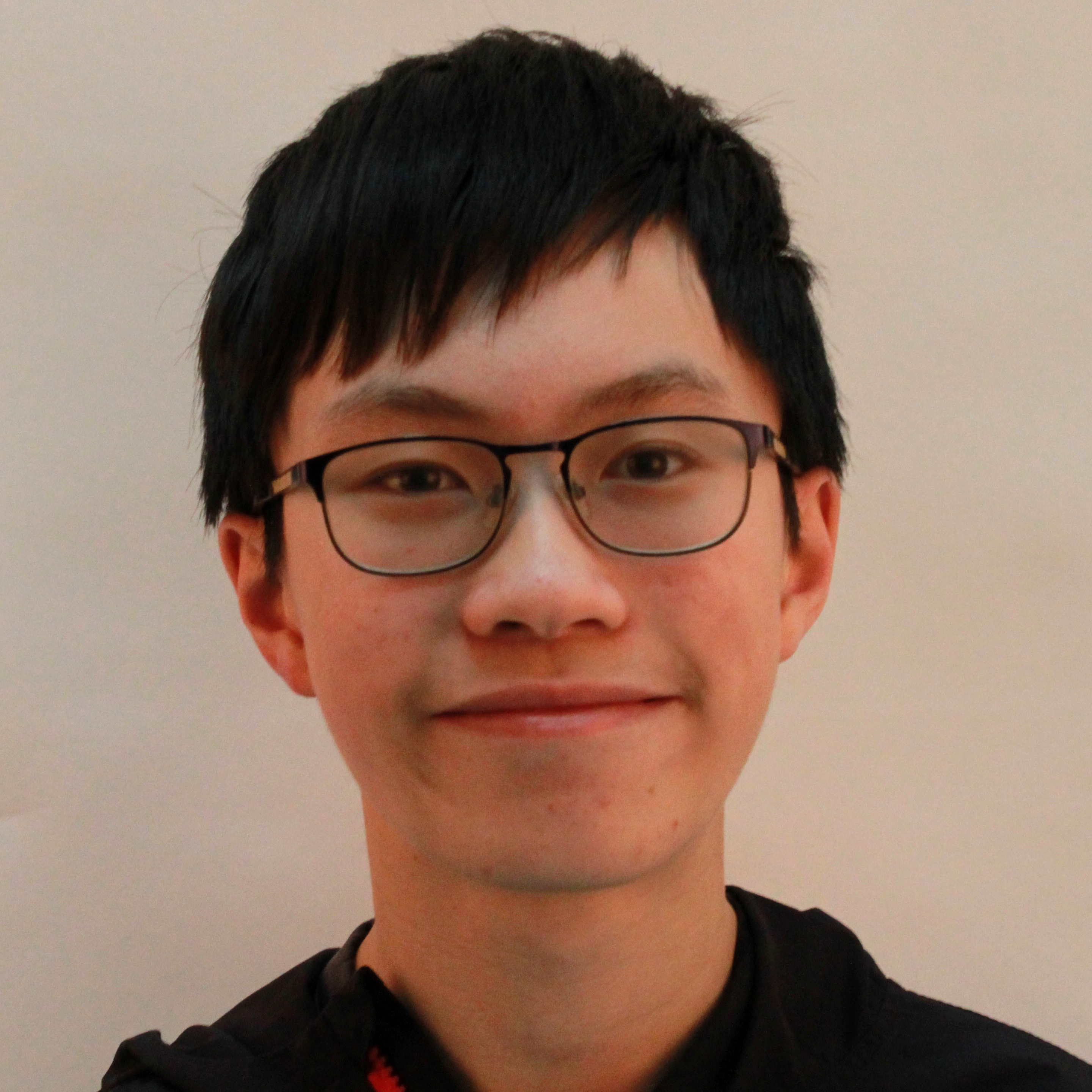
Picture of Jacky, facing head-on towards the camear

Goals

I'm going into Grade 12, and that means I have university soon. I want to develop good academic habits and do my work more, so I can get better marks. Unfor­tunately, univer­sities seem to care about marks first before people, so a high mark is the only way to ensure I actually get consi­dered as a person instead of a number on a report card.

I enjoy pro­gram­ming (as you might be able to tell from this web­site), how­ever, I also enjoy work­ing with elec­tro­nics. This is why I plan to be an elec­trical engi­neer­ing major in uni­ver­sity. Since the major is still quite com­pe­ti­tive, I will train my­self to study bet­ter both this year and next year.

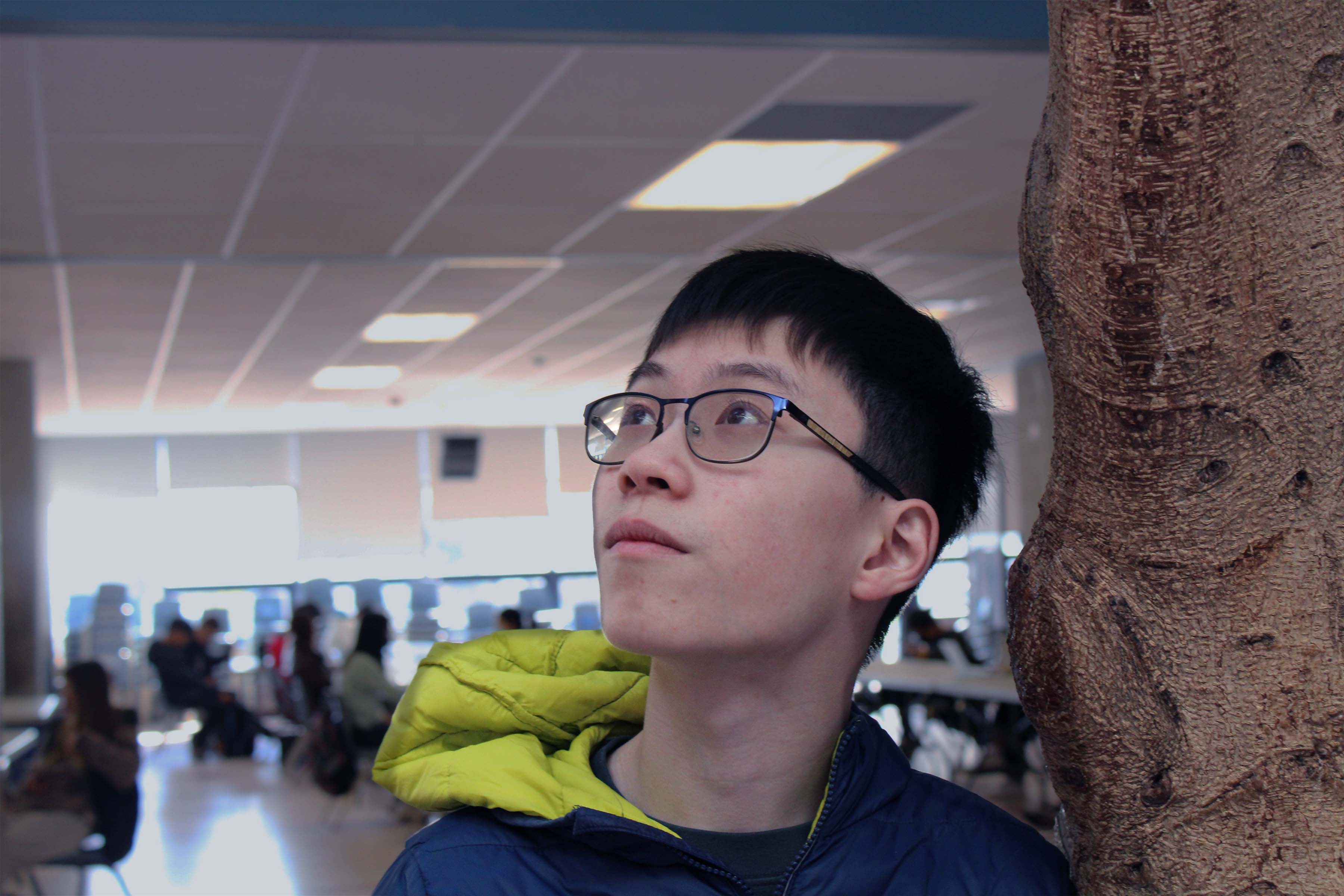
Picture of Jacky leaning against a tree.

Reflection

Out of the three projects we did this semester, I think the film was the best one. It was fun and engaging, and it ended up being absolutely hilarious to watch the final pro­duct. In terms of things I could im­prove, I would probably have re­fo­cused the camera in certain shots. I de­mon­strated learning skills the most during the film project: I set up a document to coordinate filming times and cast roles, allowing us to figure out what to film when.

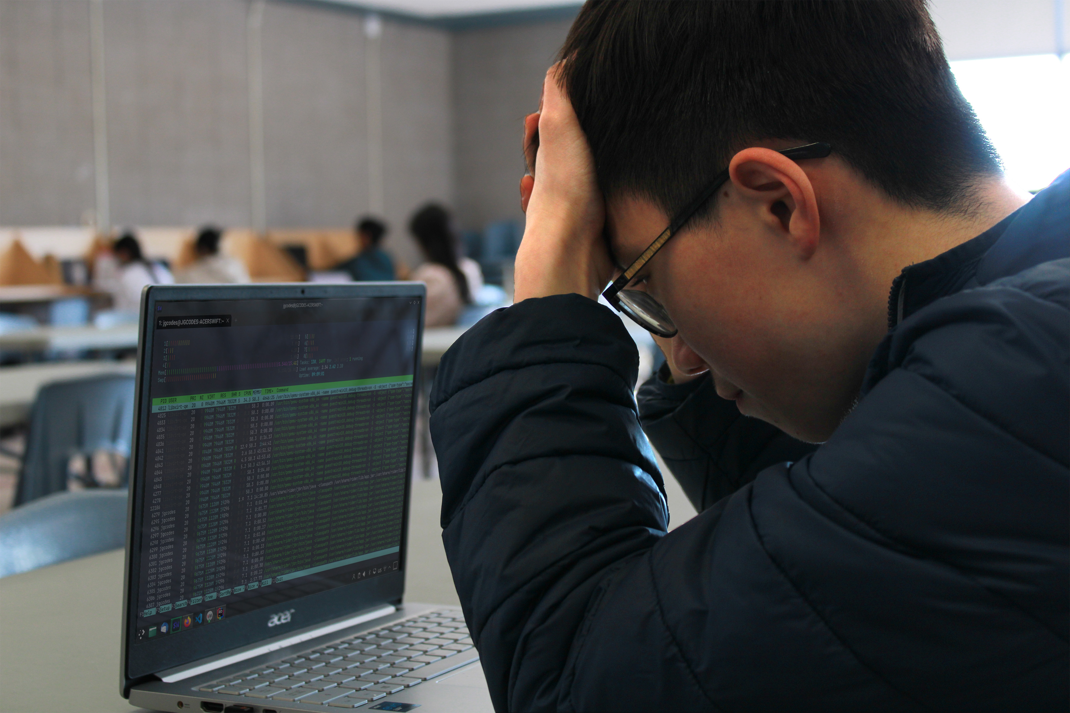
Picture of Jacky, hand against his forehead, in front of his laptop.

Describing my art style

I am a big believer in simplicity. You'll see that in this website: I use a monochromatic colour scheme, which is the simplest of the basic types of colour scheme. My ori­ginal plan for my graphic design poster entailed using ac­tual images to deliver the message, which unfortunately were not allowed. This entire web­site repeats the same basic layout for most of the content.

This website is also a basic demonstration of the principles of composition in graphic design. Contrast is applied in the navigation bar and footer: they have a different background colour to distinguish them from the rest of the site. Repetition is applied in the reuse of this image-header-text "card" throughout the site, though with alternating sides to add visual interest. Alignment is applied in the positioning of these cards: the center is exactly in the midpoint of the page. Proximity is demonstrated in the placing of relevant images near their context.

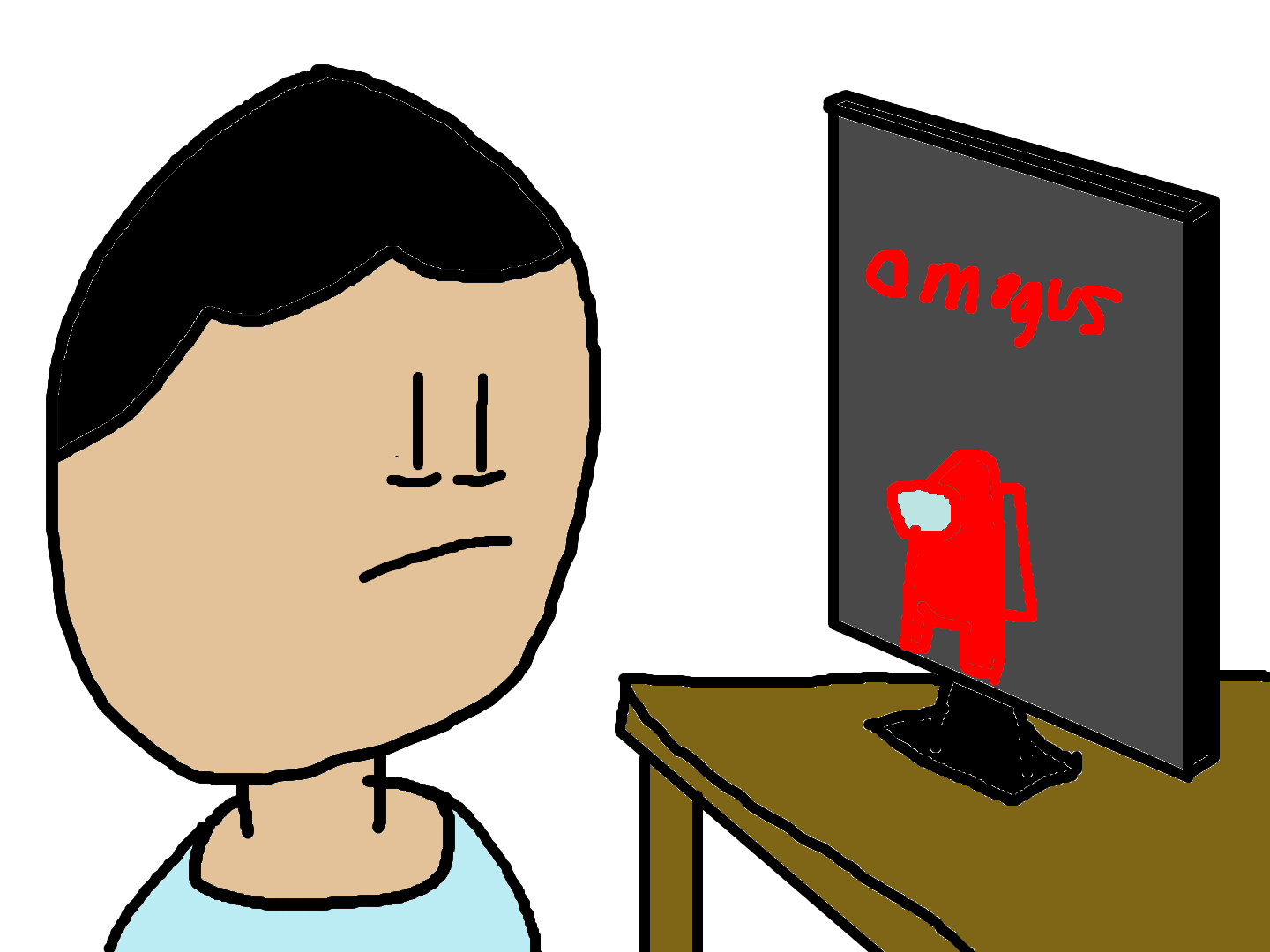
Drawing of a person being tired of Among Us memes.